Introduction & Executive Summary
Choosing the right office paint colors isn’t just a style decision—it’s a performance strategy. Calm, mid‑light, desaturated blues and greens paired with balanced neutrals often deliver the best office paint colors for productivity, but lighting, sheen, and contrast determine how those hues actually read. Fluorescents, LEDs, and windowless rooms each call for different palettes and LRVs, while collaboration, reception, and break spaces benefit from carefully chosen accents.
This guide translates color psychology into practical, room‑by‑room recommendations and shows how professional commercial office painters phase work after hours, protect IAQ, and keep projects spotless with minimal downtime. Ready to choose with confidence? Request a walk‑through: https://archpainting.com/commercial-painting/office-building-painting-services/
Office Paint Colors for Productivity: What the Science Means for Real Workspaces
Blues & Blue-Greens — Best for Focused, Analytical Tasks
Blue and blue-green families have long been associated with steadiness, clarity, and deep-focus work. Desaturated mid-light values help reduce eye strain on long screen days, making them a top pick for the best office paint colors for productivity. Avoid overly saturated or dark navies on main walls in small offices; use them for accents or cabinetry to keep spaces from feeling heavy. Pair with warm, low-chroma trim to maintain balance and prevent the space from reading too cold.
Soft Greens — Eye-Easing Hues for Long-Duration Attention
Soft, muted greens support visual recovery and calm—helpful in open offices and heads-down zones. Because greens sit between warm and cool, they can bridge mixed lighting (window daylight + overhead LED) without color shifts that distract. Choose mid-to-high LRV (Light Reflectance Value) versions for smaller rooms to keep light bouncing evenly. In client-facing spaces, a subdued sage or eucalyptus can read both modern and welcoming.
Neutrals (Greige, Taupe, Warm Gray) — Balanced, Inclusive, Low-Distraction Backdrops
A neutral base provides an inclusive backdrop for multi-use spaces and mixed teams. Warm-leaning neutrals counter cooler overhead lighting and keep skin tones natural on video calls. For the best paint color for office walls in varied task areas, look for neutrals with modest chroma—too gray can feel flat; too beige can feel dated. Layer brand color accents through art, signage, or one controlled accent wall rather than saturating an entire room.
Strategic Yellows — Memory/Ideation Boosts as Accents (Not Full Walls)
Optimistic yellows can stimulate ideation and recall, but high-chroma versions can also over-energize. Use yellow as an accent stripe, a writable wall zone, or inside alcoves rather than on primary walls. Creamy, low-chroma butter tones can work in collaboration rooms that also serve as informal lounges. Keep finish eggshell or satin for cleanability without glare under bright fixtures.
When Reds/Oranges Help (and When They Hurt) — Energy vs. Over-Stimulation
Warm reds and oranges signal urgency and energy, useful for branding moments, social hubs, or micro-activation zones. In heads-down areas, however, these hues can elevate perceived stress or visual noise. If your brand requires them, dial chroma down and confine them to accent features, furniture, or wayfinding bands. Balance with cooler neutrals and ensure sightlines from monitors stay low-contrast.
Lighting First: Matching Color to Your Office Light
Best Paint Color for Office with Fluorescent Lighting
Traditional fluorescents can cast green/blue, shifting colors colder. Counter with warm-leaning neutrals (greige, putty, mushroom) and balanced blue-greens that don’t skew overly cool. Always sample under your actual fixtures—bulb age and lens diffusers change how paint reads. If possible, upgrade to higher CRI lamps or LEDs before final color approvals; lighting quality can improve perceived color more than another round of swatches.
LED & Daylight Basics (CRI & Kelvin)
Color temperature (Kelvin) and CRI (color rendering index) shape how we perceive paint. For 2700–3500K, use neutrals with a touch of warmth to avoid dingy grays; for 4000–5000K, lean into balanced neutrals and controlled cools to stay crisp without feeling stark. High CRI (90+) keeps brand colors true in reception and client zones. Position accent colors away from direct fixture hot spots to reduce glare.
Best Paint Color for Office with No Windows / Best Paint Color for Windowless Office
Choose high-LRV soft whites and warm tints that mimic diffuse daylight—think cream, pale greige, or whisper-warm gray. Add biophilic accents (muted sages, natural wood tones) to avoid a clinical feel. Keep sheen at matte/eggshell to limit glare from overheads; reserve satin for high-touch zones. Use artwork and plantings to introduce depth and pattern without increasing visual noise.
Glare, Contrast & LRV
The most productive offices get contrast right: not too low (bland) and not too high (harsh). Aim for a 30–50 point LRV difference between walls and dark furniture or floors, and keep monitor-facing walls mid-value to maintain screen readability. Semi-gloss looks durable but can cause hotspots; reserve higher sheens for trim, doors, or clean-up zones.
Best Paint Colors for Office Spaces by Room Type
Focus Workstations & Private Offices — Calm, Mid-Light Neutrals with Desaturated Blues/Greens
Use a mid-value neutral base (LRV ~55–65) to keep eyes relaxed and sightlines consistent. Introduce desaturated blue-green accents on secondary walls or millwork to support concentration without visual fatigue. Keep trim slightly warmer to maintain healthy skin tones on video calls. For the best office paint colors for productivity, limit chroma and prioritize balance over boldness.
Collaboration & Conference Rooms — Energizing Accents with Controlled Saturation
Conference rooms benefit from a neutral field color with one deliberate accent for engagement. Consider a softened brand hue behind the camera view to add polish without distraction on video. Keep the table-facing wall lower contrast so eyes can move from screen to participant comfortably. Use acoustic panels or fabric art in complementary tones to dampen echo and add visual warmth.
Reception & Client Areas — Brand-Forward Palettes that Stay Professional
Reception should reflect brand identity while feeling welcoming. Start with a timeless neutral (greige/warm gray) and layer an accent wall, signage band, or ceiling plane in a refined brand color. Avoid trendy extremes that date quickly; instead, choose slightly grayed tints that photograph well. Metallic or wood accents add sophistication without overwhelming the palette.
Break Rooms & Wellness Spaces — Restorative Hues and Cleanable Finishes
Employees recharge here, so choose restorative greens, soft aquas, or airy creams. Use satin/pearl finishes for cleanability around appliances and seating. Add a deeper accent at banquette backs or nooks for spatial definition without shrinking the room. Incorporate durable, wipeable coatings in high-touch spots like chair rails and door frames.
Corridors/Wayfinding — Subtle Contrast to Aid Navigation without Distraction
Corridors do double duty as brand and wayfinding space. Employ a light neutral body color with a slightly deeper tone for doors or alcoves for intuitive navigation. Add color-coded bands or numbers in subdued hues that are ADA-friendly and legible under mixed lighting. Durable satin on lower walls or chair-rail height coatings improves longevity.

Best Paint Color for Commercial Office by Industry
Finance & Legal — Trust, Precision, and Low-Distraction Palettes
Favor cool-leaning neutrals, desaturated blues, and muted charcoals for a precise, trustworthy feel. Keep accents restrained and materials high-quality for longevity. In conference rooms, maintain mid-value walls to reduce glare on screens during presentations. Judicious use of wood tones adds warmth without undercutting professionalism.
Tech & Startups — Modern Neutrals + Innovation Accents (Sparingly)
Crisp neutrals with one or two simplified brand accents read contemporary and agile. Keep saturation controlled to avoid a chaotic visual field in open offices. Highlight collaboration zones with a slightly bolder hue, but preserve calm palettes at heads-down desks. Matte or low-sheen finishes align with modern aesthetics and reduce specular highlights.
Healthcare & Life Sciences — Clean, Calming, Hygienic Cues
Soft greens, blue-grays, and warm whites communicate cleanliness and calm. Use scrubbable, low-/zero-VOC systems to support IAQ and frequent cleaning. In medical office reception, a subtle accent behind check-in can improve wayfinding and brand recognition. Consider antimicrobial or enhanced-scrub coatings in high-contact areas.
Creative & Marketing — Controlled Vibrancy that Supports—Not Hijacks—Focus
Creatives benefit from curated color moments, not constant stimulation. Use a restrained neutral field with one vivid, grayed accent in ideation zones. Keep editing or color-critical workspaces neutral with high-CRI lighting for color accuracy. Modular accent elements (panels, shelves) allow quick palette refreshes without full repaints.
Municipal & Education — Accessibility, Durability, and Budget Longevity
Lean on timeless neutrals for continuity and maintenance efficiency. Use color bands for departmental wayfinding and ADA contrast compliance. Specify durable eggshell/satin on high-traffic walls and door frames to reduce total cost of ownership. Choose low-/zero-VOC products to support public health goals.
Finish Matters: Sheen, Durability & Indoor Air Quality
Best Paint Color for Office Walls… with the Right Sheen
Color + sheen = perception. Eggshell often hits the sweet spot for open offices—cleanable without glare. Matte is great where touch is minimal and acoustics benefit from softer reflectance. Reserve satin/semi-gloss for high-wear trim, doors, and break areas.
Touch-Up Strategy & Scrub Resistance
Premium resins and ceramic or urethane-enhanced formulas resist scuffs and clean easily, extending repaint cycles. Keep an on-site touch-up kit labeled by room and date to avoid sheen/lot mismatch. Train facilities staff on feathering techniques for inconspicuous fixes. This approach lowers lifecycle cost more than cutting initial material quality.
Low-/Zero-VOC & Fast Re-Occupancy
For occupied offices, low-odor systems with rapid recoat/reoccupancy specs are a must. Coordinate ventilation, negative air, and odor capture during phases to protect IAQ. Ask your painter for product data sheets (TDS/SDS) and a written plan for after-hours or weekend work to keep teams productive.
Implementation with Professional Commercial Office Painters
Color Consulting, On-Wall Samples & Mockups
Pros de-risk color decisions by testing under your actual lighting at full scale. Expect a curated short list of palettes mapped to tasks, light types, and brand guidelines. Digital mockups help stakeholders visualize outcomes before a single gallon is ordered. Fewer surprises, faster approvals, better results.
Occupied-Office Logistics
Experienced commercial office painters phase work by zone, run night/weekend shifts, and control dust/odor with protection and negative air. Clear signage and daily cleanup keep spaces usable and safe. Coordinated elevator/parking and material staging prevent delays in multi-floor buildings. The result: a faster, cleaner project with less disruption.
Safety, Insurance & Compliance
Confirm COIs, OSHA training, and MSDS/TDS on file. Ensure your vendor follows building rules, union requirements (where applicable), and uses compliant low-/zero-VOC systems. A documented safety plan and site-specific JHAs protect your people and schedule.
Estimating & Scheduling to Minimize Downtime
A thorough estimate addresses substrate conditions, prep scope, product selection, and realistic timelines. Align painting phases with meeting calendars, move-ins, and IT schedules to avoid bottlenecks. Want an experienced team to orchestrate it all? Request a proposal: https://archpainting.com/commercial-painting/office-building-painting-services/
Key Takeaways
- Color + lighting + sheen = productivity. The right combo supports focus, comfort, and brand.
- Blues/greens and balanced neutrals are the best office paint colors for productivity in most task areas.
- Match palettes to lighting. Choose warm tints for windowless rooms; manage glare with mid-value walls and the correct sheen.
- Use high-chroma colors as accents, not full fields, to energize without distracting.
- Hire professional commercial office painters to shorten timelines, protect IAQ, and keep work moving after hours.
FAQs
What’s the best color to paint an office for productivity?
Calm, mid-light, desaturated hues—especially blue-greens and soft greens—consistently support focus without eye fatigue. Pair them with warm or balanced neutrals to keep skin tones natural on video. Avoid high-chroma full-wall applications in heads-down areas; keep bolds for accents. Test on your walls under real lighting before you commit.
What are the best office paint colors for business offices with fluorescent lighting?
Fluorescents can skew colors cool or green, so counter with warm-leaning neutrals (greige, mushroom, taupe) and balanced blue-greens. Always view large swatches under your actual fixtures since lens diffusers and bulb age affect perception. If possible, upgrade to higher CRI lighting before finalizing colors—it can improve results more than swapping paint.
What’s the best paint color for an office with no windows?
Choose high-LRV soft whites or warm tints to emulate diffuse daylight and keep the room from feeling clinical. Add biophilic accents—muted greens and wood tones—for warmth and depth. Keep sheen low-to-mid (matte/eggshell) to minimize glare from overhead lighting.
Should we use accent walls in offices?
Accent walls work well for wayfinding, brand cues, and brainstorming zones—provided saturation stays controlled. Place accents outside primary monitor sightlines to avoid visual fatigue. In heads-down areas, limit accents to secondary walls or furnishings so they inspire without distracting.
Do low- or zero-VOC paints really matter at work?
Yes—low-odor, low-/zero-VOC systems support better indoor air quality and faster re-occupancy in occupied offices. Premium lines also resist scuffs and clean more easily, lowering lifecycle cost. Ask your painter for IAQ and odor-control plans when phasing work after-hours.
How often should office interiors be repainted?
High-traffic interiors typically follow a 3–5 year cycle, sooner for corridors, break rooms, and collaboration spaces. Proactive touch-ups using the same batch and finish can extend time between full repaints. A maintenance plan keeps surfaces looking fresh and protects your investment.
Can a professional crew paint after hours or on weekends to avoid downtime?
Absolutely. Experienced commercial office painters plan night/weekend shifts, phase spaces, and use quick-dry systems to keep teams productive. With protection, signage, and daily cleanups, you can reopen areas safely the next morning.
Related Reading
- Choosing the Right Season for Office Building Painting — https://archpainting.com/best-season-for-office-building-painting/
- How to Minimize Downtime During Painting Projects — https://archpainting.com/how-to-minimize-downtime-during-painting-projects/
- Completing Office Painting Projects Over Long Weekends — https://archpainting.com/long-weekend-commercial-office-painting-projects/
- Seasonal Maintenance Painting for Property Managers — https://archpainting.com/seasonal-property-maintenance-painting/
Refresh Your Office, Boost Productivity
From on‑site color consulting with full‑scale wall samples to night/weekend scheduling, negative‑air and odor control, low‑/zero‑VOC systems, and fully insured, safety‑first crews, Arch plans your repaint to minimize disruption and maximize results. Partner with our experienced commercial office painters to select productivity‑friendly palettes, phase work intelligently, and deliver a spotless finish that supports your team—then reopen on schedule.
Request your proposal today: https://archpainting.com/commercial-painting/office-building-painting-services/
Related Posts
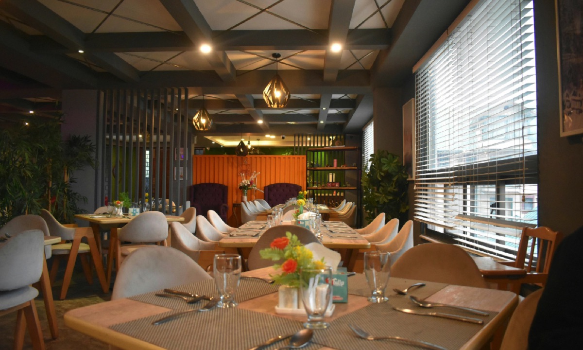
In the fast-paced and competitive restaurant industry, first impressions are everything. While menu quality and customer service are essential, the physical appearance of your restaurant [...]
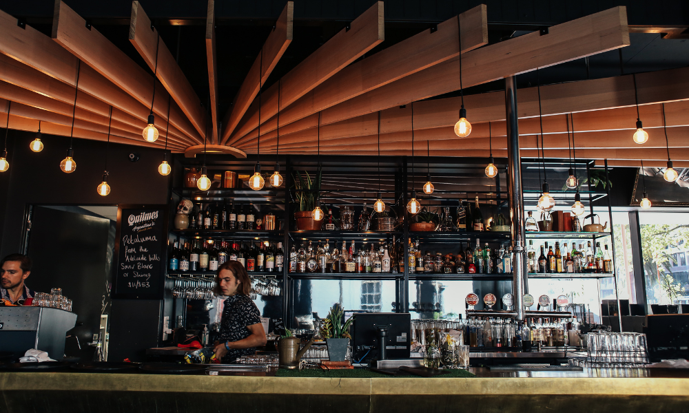
Overview A well-known neighborhood bar and grill with more than 1,000 locations across the United States, turned to Arch Painting when it was time [...]

Most restaurant owners focus on menu engineering, pricing, staffing, or marketing when trying to boost sales. But one of the most influential elements of customer [...]