Introduction
Colors do more than decorate a medical office—they shape how patients feel, how staff focus, and how clean a space appears. In care environments, choices should lower anxiety, improve wayfinding, and work with each room’s lighting, tasks, and finish requirements. Calm, desaturated hues (soft greens, blue‑greens, warm neutrals) are workhorses, while glare, sheen, and contrast determine whether those colors comfort or distract. Throughout this guide we translate color psychology into lighting‑aware, room‑by‑room recommendations tailored to clinics and therapy practices. When you’re ready to plan implementation with minimal disruption, book a walkthrough with our team: Healthcare Facilities Painting Services.
Executive Summary
- What works: calming colors for medical offices—desaturated greens, blue‑greens, warm whites/neutrals—paired with the right LRV and sheen for each room.
- What to watch: fluorescent/LED color shift, windowless rooms, ADA contrast, and trauma‑informed design in behavioral health and therapy spaces.
- Why pros: occupied‑care phasing (nights/weekends), IAQ/odor control, documented compliance, and durable, scrub‑class finishes for long‑term value.
- Next step: validate on‑wall samples under your actual lighting before full rollout; get a written plan from experienced healthcare painters.
Why Color Matters in Healthcare & Therapy Environments
Anxiety Reduction & Perceived Cleanliness
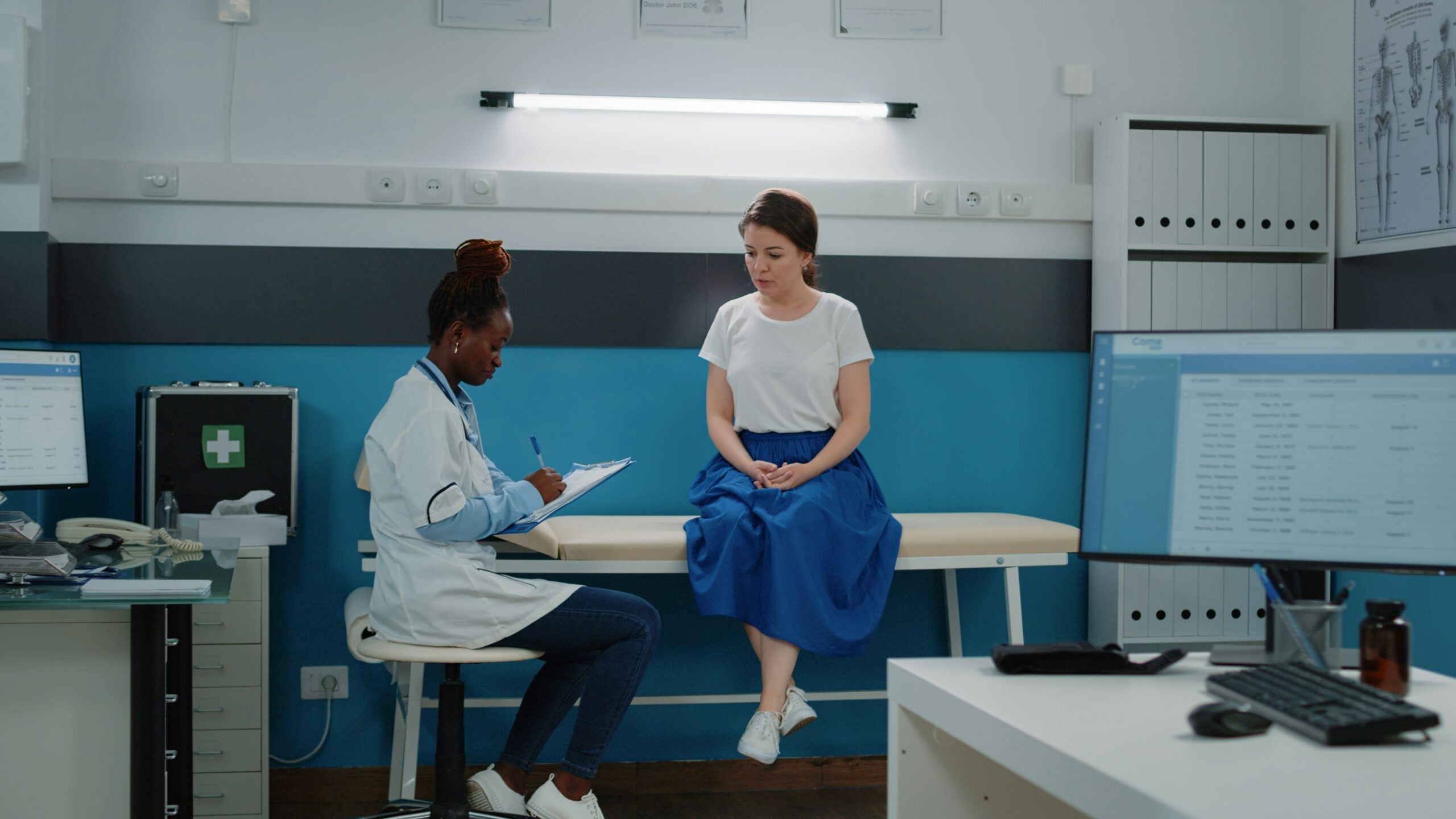
In first‑impression zones like reception and waiting rooms, mid‑value, low‑chroma hues reduce arousal and help spaces feel hygienic without looking stark. Warm whites and balanced neutrals keep skin tones natural, which is reassuring during check‑in and consultation. Overly cool, high‑brightness whites can look clinical in the wrong light and accentuate shadows. Aim for layered warmth—wood tones, textiles, and plants—over a calm wall color for comfort and trust. Target mid‑ to high‑LRV (about 55–70) so spaces feel bright without glare, and avoid bluish “paper white” under cool lamps that can make complexions look sallow. Review large swatches at several times of day to ensure the palette stays soothing as light shifts.
Trauma-Informed & Neurodiversity-Friendly Choices
Therapy and behavioral health rooms benefit from gentle chroma, softened contrast, and matte/eggshell sheens to avoid glare. Desaturated blues, sages, muted mauves, and clay tints read supportive without being dull. Avoid high‑saturation reds/oranges in extended sessions; use them sparingly in art or small accents if at all. Provide small areas of visual interest while keeping the primary field color quiet and predictable. Offer dimmable lamps and layered lighting so clients can adjust brightness, and add optional, easily removable personalizing elements (pillows, art) in muted tones to keep the space adaptable.
ADA Contrast & Wayfinding in Corridors and Signage
Effective wayfinding lowers stress for patients and caregivers. Use a light body color with a slightly deeper door or alcove tone to guide movement. Maintain readable contrast for door frames, handrails, and signage, and avoid busy patterns near corners and thresholds. Consistent color cues by department help new patients navigate confidently. Keep floor–wall transitions readable without harsh striping, repeat color cues at decision points (intersections, elevators), and maintain consistent contrast at hardware to aid low‑vision users.
Cultural Sensitivity & Inclusive Palettes
Preferences for color are shaped by culture, age, and personal experience. Softened palettes with natural undertones are generally well‑tolerated across groups, while harsh contrasts or novelty hues can alienate. In diverse communities, keep base colors universal and introduce brand tones as restrained accents. Co‑create options with stakeholders and test in‑situ before committing. Where strong brand colors are required, gray them down a step to feel professional and universally welcoming, and invite feedback from a patient advisory group to avoid unintended connotations.
Best Paint Colors by Office Type (Practical Picks & Pitfalls)
Primary Care / Internal Medicine — Quiet Confidence with Soft Greens, Blue‑Grays, Warm Neutrals
These offices need soothing paint colors for doctors’ offices that signal competence without sterility. Sage, blue‑gray, and warm greige in the mid‑value range reduce glare and eye strain. Keep accents low‑chroma and avoid stark black‑white schemes in waiting rooms. Add wood or textile elements to elevate warmth and comfort. Aim for walls in the LRV 55–65 range with eggshell sheen for cleanability, and use satin on doors/chair rails to handle frequent contact without creating shiny hotspots.
Pediatrics — Cheerful, Softened Hues with Playful Accents
Children respond well to color, but hyper‑saturated walls can overwhelm. Use a warm neutral field with softened teal, coral, or butter‑yellow accents placed away from exam sightlines. Graphics and murals should be cheerful yet subdued to keep anxiety in check. Specify scrub‑resistant finishes for high‑touch durability. Reserve bolder hues for millwork, graphics, or wayfinding rather than full walls, and segment zones by age with slightly different accent families while keeping the neutral field consistent.
Dental — Clean, Modern Calm: Blue‑Greens and Warm Whites
Dental spaces benefit from balanced blue‑greens and warm whites that read clean but not cold. Mid‑value walls reduce glare from task lighting and reflective surfaces. Reserve any bold branding for signage or a single accent plane. Choose eggshell for walls, satin for doors/trim for easy wipe‑downs. Avoid greenish wall casts that can interfere with shade selection for restorations, and pair palettes with high‑CRI lighting so smiles look natural in mirrors and photos.
Behavioral Health & Therapists’ Offices — Calming Colors for Therapy Office
For therapy offices, best colors include dusty blue, muted sage, warm greige, clay, and soft mauve. These palettes minimize stimulation yet feel personal and warm. Keep sheen low and textures soft to reduce echoes and visual noise. Avoid high contrast behind the clinician’s seat to maintain a stable visual frame. Add a floor lamp or sconce on a dimmer to soften ceiling glare, and provide a neutral, uncluttered focal wall in the client’s sightline to support grounding exercises.
Physical Therapy & Rehab — Energizing Yet Steady
PT environments need motivation without agitation. Start with balanced neutrals and introduce desaturated green/teal accents in circulation or equipment zones. Maintain mid‑value walls for glare control during movement and evaluation. Specify high‑scrub coatings near equipment storage and training areas. Ensure safe floor–wall contrast so depth is easy to judge during mobility work, and use muted safety striping only where necessary to avoid visual clutter.
Women’s Health / OB‑GYN — Restorative Neutrals with Gentle Undertones
Warm neutrals with a hint of blush, peach, or clay can feel restorative and dignified. Keep accents subtle—muted terracotta or eucalyptus—to avoid saccharine tones. Use matte/eggshell walls with satin on doors and chair rails for cleanability. Lighting should be high‑CRI to render skin tones accurately. In lactation or recovery rooms, slightly warmer tints can boost comfort without reading pink, and nature‑based, low‑contrast artwork helps promote calm.
Oncology & Infusion Suites — Low‑Stimulus, Mid‑Value Calm
Patients spend long stretches here, so choose low‑contrast, mid‑value fields that reduce fatigue. Soft green‑grays, blue‑grays, and warm creams promote steadiness. Avoid high‑chroma accents near chairs; introduce interest with art and natural textures instead. Prioritize acoustic softness and low‑glare finishes. Consider circadian‑friendly lighting schedules and window‑mimicking visuals where daylight is limited, and keep accent moments in peripheral vision rather than directly in view.
Imaging (MRI/CT) — Soothing, Low‑Contrast Palettes
Equipment rooms perform best with low‑contrast, low‑chroma palettes that reduce spatial disorientation. Use controlled warm neutrals or blue‑greens and avoid bright accents near large equipment housings. Ensure wall finishes resist frequent cleaning. Coordinate with lighting to minimize shadowing. Paint ceilings a touch lighter than walls to reduce perceived enclosure, and avoid fine repeating patterns that can visually “vibrate” under scanner lighting.
Urgent Care & Specialty Clinics — Clear Wayfinding, Durable Finishes
These high‑traffic clinics need clear visual hierarchy. Use a neutral base with color‑coded bands or door accents for departments. Keep saturation restrained to prevent stress in waiting areas. Choose durable, moisture‑tolerant systems and plan touch‑up kits for fast maintenance. Protect outside corners with durable guards painted to match trim for a seamless look, and plan a 3–4 year touch‑up cycle for front‑of‑house areas (sooner where traffic is heaviest).
Best Paint Colors by Room/Zone (Function‑First)
Waiting Rooms — Soothing Paint Colors for Doctors’ Offices
Aim for mid‑value, low‑chroma hues that lower anxiety and photograph well. Warm whites, greiges, and soft sages are dependable choices under mixed lighting. Layer brand color through art or a single accent plane rather than multiple saturated walls. Provide tactile warmth—wood, plants, textiles—over the calming color field. Use slightly varied but related tones in seating groups to break up large rooms, and avoid high‑gloss finishes behind windows where glare and streaking show.
Exam Rooms — Balanced Blue‑Green or Warm Neutral; High LRV without Glare
Exam rooms need bright but not harsh light, so pair high‑LRV warm neutrals or gentle blue‑greens with matte/eggshell finishes. Keep the wall behind the patient non‑glossy to reduce hotspots from exam lights. Limit high‑chroma accents to small, out‑of‑view areas. Maintain ADA‑readable contrast for fixtures and hardware. Verify that common disinfectants won’t burnish matte walls in high‑touch zones (upgrade to washable matte if needed), and coordinate field colors with casework and curtains to keep the room cohesive.
Procedure Rooms — Low‑Distraction, High‑Scrub Neutrals
Choose low‑chroma neutrals that minimize visual noise and support concentration. Specify scrubbable, chemical‑resistant finishes as required by your facility’s standards. Maintain consistent mid‑value contrast with floors and casework for depth without glare. Document coatings in a maintenance log for consistent touch‑ups. Where required, consider antimicrobial or moisture‑tolerant coatings at sink walls and splash zones, and keep a continuous base color so surface contamination is easy to spot.
Consult & Therapy Rooms — Best Colors for Therapist Office
Therapy consult rooms benefit from quiet, grounding palettes: dusty blue, muted sage, warm greige, and clay. Keep contrasts gentle and favor matte/eggshell sheens to decrease visual sparkle. Add texture via rugs and acoustic panels to soften sound. Use one subtle accent plane at most to preserve a calm focal field. Table lamps at 2700–3000K help faces look natural and relaxed, and light‑filtering window treatments preserve privacy while avoiding a closed‑in feel.
Reception & Check‑In — Brand‑Forward Accent, Skin‑Tone‑Friendly Light
Establish trust with a timeless neutral field and one refined brand accent at the desk or backdrop. Avoid overly cool whites that create unflattering shadows. Choose high‑CRI lighting for accurate color rendering in patient photos and ID checks. Keep finishes cleanable where staff interact with the public. Consider a camera‑friendly backdrop tone for ID photos/telehealth intros, and where privacy is crucial, add acoustic panels or screens in complementary hues.
Corridors & Wayfinding — Subtle Contrast, ADA‑Aware Color Bands
Corridors connect the experience. Use a light body color with a slightly deeper door/alcove tone for legibility. Add subdued color bands or numbering for departments; avoid glossy stripes that create glare. Durable eggshell/satin on lower walls improves longevity. Choose a scuff‑resistant base coating for the lower 36–48 inches of wall to withstand carts and hand traffic, and keep color transitions consistent at floor junctions to reduce trip risk.
Staff Areas & Break Rooms — Restorative Hues with Cleanable Finishes
Support staff recovery with soft greens, aquas, or warm creams. Use satin/pearl near appliances and sinks for easy cleaning. Provide one deeper accent behind seating to add depth without shrinking the room. Maintain consistent trim finishes for quick touch‑ups. Use warmer light (~3000K) to encourage decompression, and add cork or fabric tack boards in coordinating hues to manage noise and provide functional display space.
Lighting & Finish Selection for Clinics
Fluorescent & LED (CRI/Kelvin) — Best Paint Colors for Medical Office under Cool Light
Cooler lamps can skew colors green/blue; counter with warm‑leaning neutrals and balanced blue‑greens. Evaluate large samples under actual fixtures and lenses, as age and diffusers affect color. Where possible, upgrade to 90+ CRI lighting to improve color rendering and patient comfort. Validate final choices with on‑wall mockups. If fixture changes aren’t feasible, lens replacements or sleeves can nudge lamps toward neutral white so paint reads truer.
Windowless Rooms — Best Paint Color for Doctors’ Office with No Windows
Mimic daylight using high‑LRV warm whites, pale creams, or light greiges. Add biophilic accents—muted sage, natural wood tones—to avoid a clinical feel. Keep sheens low‑to‑mid to control glare under overheads. Artwork can introduce calm imagery without boosting chroma. Tunable LED systems that warm slightly toward evening can reduce fatigue in long clinical days, and a softly warmed white on ceilings helps prevent the cave effect.
Glare, Contrast & LRV — Keep Instruments & Charts Readable
Aim for balanced contrast: enough to define edges and signage but not so high that glare becomes fatiguing. Keep monitor‑facing or instrument‑adjacent walls mid‑value to preserve readability. Reserve higher sheens for trim/doors and high‑touch areas. Avoid glossy finishes on large field walls. Anti‑glare films on exterior glazing and diffusers on bright fixtures can stabilize how colors read; walk the space with sample boards and a laptop to test screen comfort before sign‑off.
Sheen Strategy — Matte/Eggshell for Patient Zones; Satin on Trim
Matte and eggshell help patient areas feel soft and reduce specular highlights. Satin/pearl suits doors, chair rails, and other high‑touch surfaces that need frequent cleaning. In splash zones or near equipment, consider enhanced‑scrub or moisture‑tolerant systems. Match sheen and batch for invisible touch‑ups. Newer washable‑matte technologies provide cleanability without the sheen jump—ideal for therapy and waiting areas; keep a labeled touch‑up kit per room to prevent patchiness.

Cleanability, IAQ & Compliance
Low/Zero‑VOC & Odor Control Plans for Occupied Care
Select low‑/zero‑VOC systems for faster re‑occupancy and better indoor air quality. Plan night/weekend phases, increase ventilation, and use negative‑air containment where appropriate. Odor‑absorbing practices keep sensitive areas comfortable. Request product TDS/SDS for your records. Stage materials outside patient zones during cure, and include a brief flush‑out period with enhanced ventilation to improve comfort at re‑open.
Scrub‑Class Coatings & Moisture‑Resistant Systems
Healthcare walls see frequent cleaning—specify coatings with high scrub ratings. In wet rooms or near sinks, moisture‑tolerant primers and topcoats reduce failures. Ceramic/urethane‑reinforced formulas withstand abrasion without excessive sheen. Log products and colors per room to streamline maintenance. Request independent scrub‑resistance and stain‑removal data when comparing products; slightly higher material costs often pay back through fewer repaints.
Documentation: TDS/SDS, COIs, Safety Plans, Building Rules
Work with contractors who provide complete documentation: certificates of insurance, OSHA training, site‑specific safety plans, and building‑rule compliance. Clear paperwork ensures risk is managed and schedules stay intact. Keep a paint schedule and room matrix on file for future touch‑ups. Maintain a digital finish schedule with product, color, sheen, and batch numbers, and align contractor check‑ins with compliance calendars to simplify audits.
Implementation with Professional Commercial Healthcare Painters
Color Consulting, On‑Wall Samples & Stakeholder Mockups
Experienced healthcare painters narrow options to lighting‑smart palettes and test full‑scale swatches on site. Stakeholder mockups help leadership, facilities, and clinicians align quickly. The result is fewer surprises and faster approvals. Need help coordinating? Our team can manage end‑to‑end. Brief interviews with front‑desk, clinicians, and facilities often surface issues color can solve—like glare on tablets or hard‑to‑find doors—so lock approvals before procurement to keep schedules tight.
Occupied‑Care Logistics (Night/Weekend Phasing, Containment)
Phased schedules keep clinics operating: nights, weekends, and segmented zones minimize disruption. Crews protect equipment, create clean containment, and maintain daily housekeeping so areas reopen safely. Elevator, parking, and material staging are orchestrated to avoid bottlenecks. Coordinate with facility risk/infection‑control teams on containment where needed, and post nightly “what’s painted” notices so staff stay informed.
Safety, Insurance & Compliance
Choose partners with proven healthcare experience, clear COIs, and OSHA training. Ensure adherence to facility protocols, infection‑control practices, and low‑odor products. A documented plan protects patients, staff, and schedules. In sensitive settings, confirm crew badging/background checks and vaccination policies per facility rules, and expect short daily safety huddles as areas shift.
Estimating & Scheduling to Minimize Disruption
A thorough estimate addresses substrate repairs, prep, product selection, and realistic timelines. Align painting phases with clinic hours, provider schedules, and equipment availability. Request a written communication plan so staff know what’s happening and when. Build 10–15% contingency for substrate surprises behind equipment, and use clear temporary signage/wayfinding during phases to reduce patient frustration. Learn more here: Healthcare Facilities Painting Services
Key Takeaways
- Calming, desaturated hues—especially greens, blue‑greens, and warm neutrals—support patient comfort and staff focus.
- Match color to lighting and room function; windowless rooms and fluorescent/LED settings require LRV and chroma adjustments.
- Control glare and contrast for readability, ADA wayfinding, and low‑stress visuals.
- Specify cleanable, low/zero‑VOC systems to protect IAQ and enable fast re‑occupancy.
- Use professional healthcare painters for occupied‑care phasing, odor control, and documented compliance.
FAQs
What’s the best paint color for a doctors’ office?
For most doctors’ offices, start with a calm, mid‑value neutral or soft green/blue‑green that reads clean without feeling cold. Warm whites, greiges, and balanced blue‑grays are reliable in waiting and exam rooms under mixed lighting. Avoid stark, high‑contrast schemes that can feel harsh or clinical. Validate choices with on‑wall samples under your actual fixtures before ordering paint.
What are the most calming colors for a therapy office?
Therapy offices benefit from desaturated, nature‑inspired hues: dusty blue, muted sage, warm greige, clay, and soft mauve. Keep contrast gentle and use matte/eggshell sheens to reduce glare and visual “sparkle.” One subtle accent plane is often enough; let texture and lighting add depth. Avoid high‑chroma reds/oranges that can be activating during longer sessions.
Are bright colors okay in pediatric clinics?
Yes—in moderation. Use a warm neutral field and introduce cheerful accents (softened teal, coral, butter yellow) where they won’t dominate exam sightlines. Murals and graphics should be playful yet subdued to prevent overstimulation. Choose scrub‑resistant finishes to withstand frequent cleaning.
What sheen works best for medical office walls?
Matte and eggshell are ideal for patient‑facing walls because they control glare and feel calm. Use satin/pearl on doors, chair rails, and other high‑touch surfaces for better cleanability. In splash or high‑wear zones, consider enhanced‑scrub or moisture‑tolerant systems specified for healthcare use. Match sheen and batch numbers for seamless touch‑ups.
How should we choose colors for windowless exam or therapy rooms?
Mimic daylight with high‑LRV warm whites, light greiges, or pale creams, then add biophilic accents like muted sage or wood tones. Keep sheens low‑to‑mid to tame overhead glare. Use art and texture to add depth without increasing chroma. Always test swatches under the installed lighting.
Do low/zero‑VOC paints really matter in healthcare?
Absolutely. Low‑/zero‑VOC systems help protect indoor air quality, reduce odors, and support faster re‑occupancy in occupied‑care settings. Pair them with ventilation and odor‑control plans during phasing. Ask your contractor for TDS/SDS and an IAQ strategy tailored to your facility.
Can painting be done after hours without closing the clinic?
Yes. Experienced healthcare painters schedule night/weekend shifts, phase spaces, and use negative‑air containment and dust/odor control to keep operations running. Daily housekeeping restores areas so they can safely reopen by morning. A clear communication plan keeps staff informed and patients unaffected.
Related Reading
- Choosing the Right Season for Office Building Painting — https://archpainting.com/best-season-for-office-building-painting/
- How to Minimize Downtime During Painting Projects — https://archpainting.com/how-to-minimize-downtime-during-painting-projects/
- Completing Office Painting Projects Over Long Weekends — https://archpainting.com/long-weekend-commercial-office-painting-projects/
- Seasonal Maintenance Painting for Property Managers — https://archpainting.com/seasonal-property-maintenance-painting/
Healthcare Spaces Painted Safely & Calmly
Create a soothing, hygienic environment with palettes tailored to your specialty—planned around patient schedules and delivered with clean sites, odor control, and fully insured crews. Partner with Arch’s healthcare painting team for color consulting, on‑wall samples, occupied‑care phasing, and durable, low‑VOC finishes, then reopen on schedule with confidence. Request a walkthrough: https://archpainting.com/commercial-painting/healthcare-facilities/
Related Posts
When guests leave reviews, they rarely talk only about the food. They comment on ambiance, cleanliness, vibe, lighting, and overall restaurant appearance. That’s why a [...]
In the fast-paced and competitive restaurant industry, first impressions are everything. While menu quality and customer service are essential, the physical appearance of your restaurant [...]

Overview A well-known neighborhood bar and grill with more than 1,000 locations across the United States, turned to Arch Painting when it was time [...]